Brand guide hero image
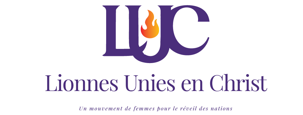
Brand Identity · Lionnes Unies en Christ

Brand Guide

The visual language, colors, typography and mark of a women's movement built to awaken nations.

Three Letters One Fire Unbreakable
Scroll
01 · Brand Overview

Brand Essence

Three Letters.
One Fire. Unbreakable.

The L·U·C monogram tells the whole story: three letters fused into one inseparable mark — remove one and the structure falls. Lionnes Unies en Christ was built for women who understand that their greatest strength is each other.

At the heart of the mark burns a fire — not decoration, but declaration. The flame is the Holy Spirit: untameable, impossible to contain, spreading from woman to woman, nation to nation.

And beneath it all — the lioness. Bold. Fierce. Unshakeable. She does not roar to prove her strength. She moves, and the ground shifts.

United by Covenant
🔥
Ablaze with the Spirit
Lionnes Unies en Christ
Un mouvement de femmes pour le réveil des nations
Luke 4:18 Matthew 28:18–20
14
Nations
10+
Years of Ministry
1
Fire. Unbreakable.
03 · Color Palette

The Colors

Every color earns its place. Together they tell the full story — covenant, fire, grace, and light.

Primary Colors
Royal Violet / Deep Purple
The color of sovereignty and sacred mystery. The quiet authority of a woman who knows exactly who commissioned her.
HEX #3D2B6B RGB 61, 43, 107 CMYK 43, 60, 0, 58
Primary brand color · monogram · wordmark · headers · primary backgrounds
Flame Gold / Amber
The warmth of the Holy Spirit made visible. This is the fire that rises — radiant, purposeful, unstoppable.
HEX #E8A020 RGB 232, 160, 32 CMYK 0, 31, 86, 9
Flame detail · accent color · highlight backgrounds · Gold version logo
Supporting Colors
Flame Coral
#D4544A
Flame accent · CTAs · highlights
Pure White
#FFFFFF
Reversed logo · dark-bg typography
Warm Cream
#FAF8F4
Page backgrounds · input fields
Near Black
#0E0823
Vision sections · deep backgrounds

Full brand palette — primary tones and tints

04 · Typography

The Typefaces

Primary Typeface
Playfair
Display
AaBbCcDdEeFfGgHhIiJjKkLlMmNnOoPpQqRrSsTtUuVvWwXxYyZz
0 1 2 3 4 5 6 7 8 9
Headlines Hero titles Pull quotes Event names Dates

A high-contrast serif of grace and weight. It carries both the elegance of a woman and the authority of a decree in the same breath.

Secondary Typeface
Poppins
AaBbCcDdEeFfGgHhIiJjKkLlMmNnOoPpQqRrSsTtUuVvWwXxYyZz
0 1 2 3 4 5 6 7 8 9
Body copy Labels Buttons UI elements Captions

A geometric sans-serif with warmth. Clean, legible, and quietly confident — the voice behind the declaration.

Type in Practice
Display / Hero A Lioness does not burn alone.
Section Title We gather — and together we awaken nations.
Body / Poppins Our events are open to everyone, even those who are not members of our community. Whether you join us on Zoom, YouTube, or in person — you are welcome here.
Label / Caps Upcoming Events · 2025–2026 · Register to participate
05 · Photography & Imagery

Visual Direction

The imagery across this brand captures women in their fullness — in community, in stillness, and in quiet confidence. The photography does not perform. It simply bears witness to what these women already are.

🤝
In Community

Women gathered with hands raised in shared purpose. Unity made visible — not women in the same room, but women so deeply connected their strength is structural.

🙏
In Stillness

A woman at rest in prayer, unhurried and grounded. The quiet power of a life surrendered — intimate, real, not staged.

👑
In Confidence

A woman standing alone, sure of herself. Friends close, comfortable, and real. Women walking side by side, choosing each other.

Use
  • Authentic, unposed moments of connection
  • Natural light or warm studio lighting
  • Diverse women from the 14 nations LUC serves
  • Expressions of joy, prayer, purpose
  • Black & white for editorial / testimonial contexts
  • Images that can carry a violet or gold overlay
Avoid
  • Staged, corporate, or stock-photo aesthetics
  • Harsh, flat, or cold lighting
  • Images that feel performative rather than present
  • Low resolution or pixelated photography
  • Competing brand colors within the frame
  • Cropping that removes hands or faces at edges
06 · Brand in Action

Usage Guidelines

01
Logo Integrity

Never stretch, rotate, recolor, or separate the elements of the monogram. The linked letters must always be clearly readable — unity must always be visible.

02
Color Fidelity

Always use the exact brand hex values. Never approximate Royal Violet or Flame Gold — they carry specific symbolic weight that generic purples and yellows cannot replace.

03
Typography Pairing

Use Playfair Display for all display and editorial text. Use Poppins for all interface, body, and functional copy. Never substitute or mix with other typefaces.

04
Voice & Tone

Speak with the authority of a woman who knows who sent her. Never tentative. Never apologetic. Declarative, warm, and Spirit-filled in equal measure.

05
Digital Applications

On digital backgrounds darker than 50% grey, use the reversed (white) logo. On light backgrounds, use the full-color primary logo. Never place the primary logo on a busy photograph without a solid color underlay.

06
Brand Collateral

Conference badges, tote bags, t-shirts, and event materials should always follow the two approved colorways: white-on-violet or white-on-gold. Maintain clear space on all merchandise.

LUC
The Covenant
"A Lioness does not burn alone.
We gather — and together we awaken nations."

— Lionnes Unies en Christ · Luke 4:18